Altamoda Dolcegabbana
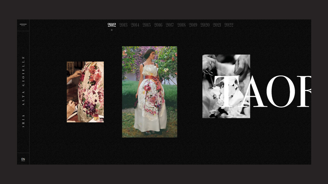
altamoda.dolcegabbana If your are visiting this website so first of all you see the loader of dolce & gabbana. then you can scroll to change the next slide an it’s horizzonally scroll that’s the cool things. left side is navigation toggle menu (also called burger menu), below the marquee text continuesly scrolling over there. also he has using year wise timeline top of the page when you go inside the page. i hope you have a great experience of this website.
Mario Dragicevic
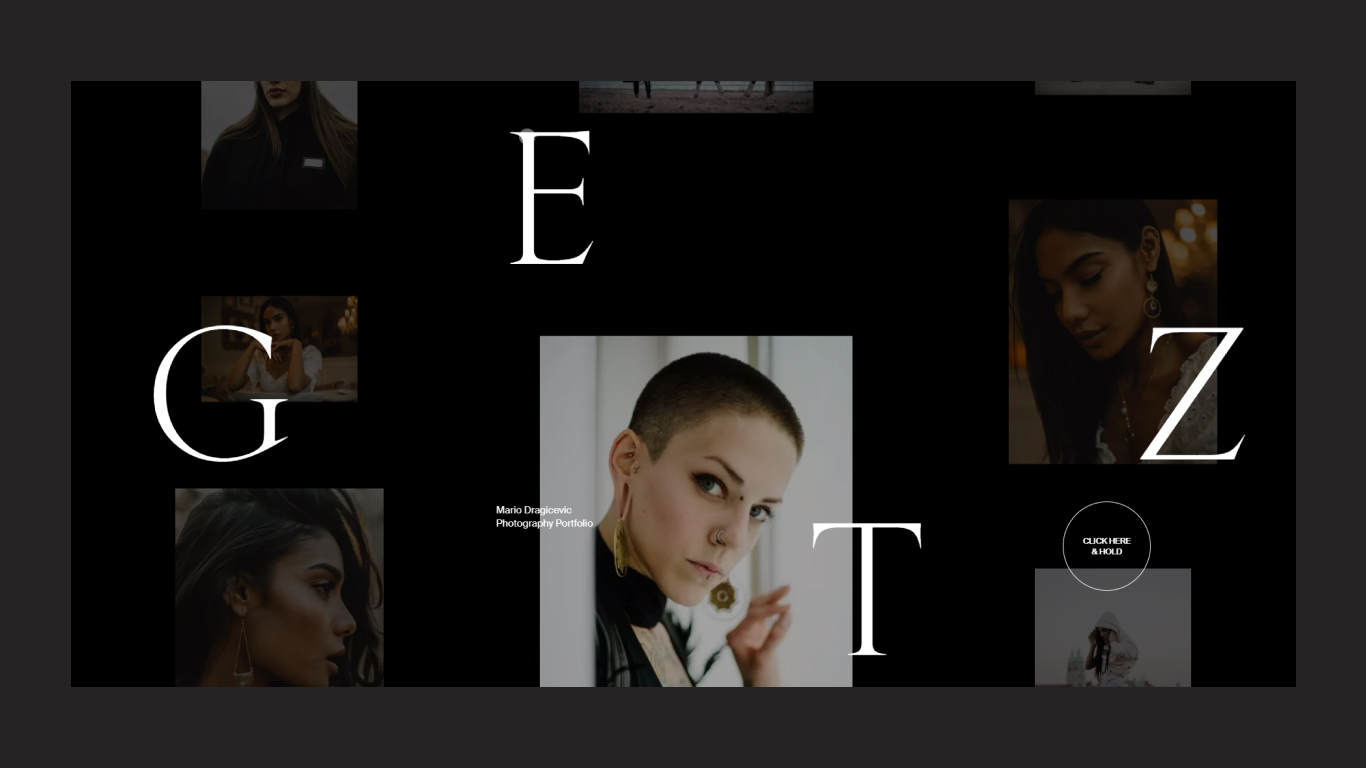
mariodragicevic This website functionality is smooth animation, fadein fadeout image and if you want to enter the main website you can press and hold the circle button after you’ll enter this website. enter the website then you scroll horizontally and you hover a specific project to show hidden image behind the main images, and you click hold the circle button to go inside the project page with smooth page transition. i must recommend to you, visit the website.
Terminal 27
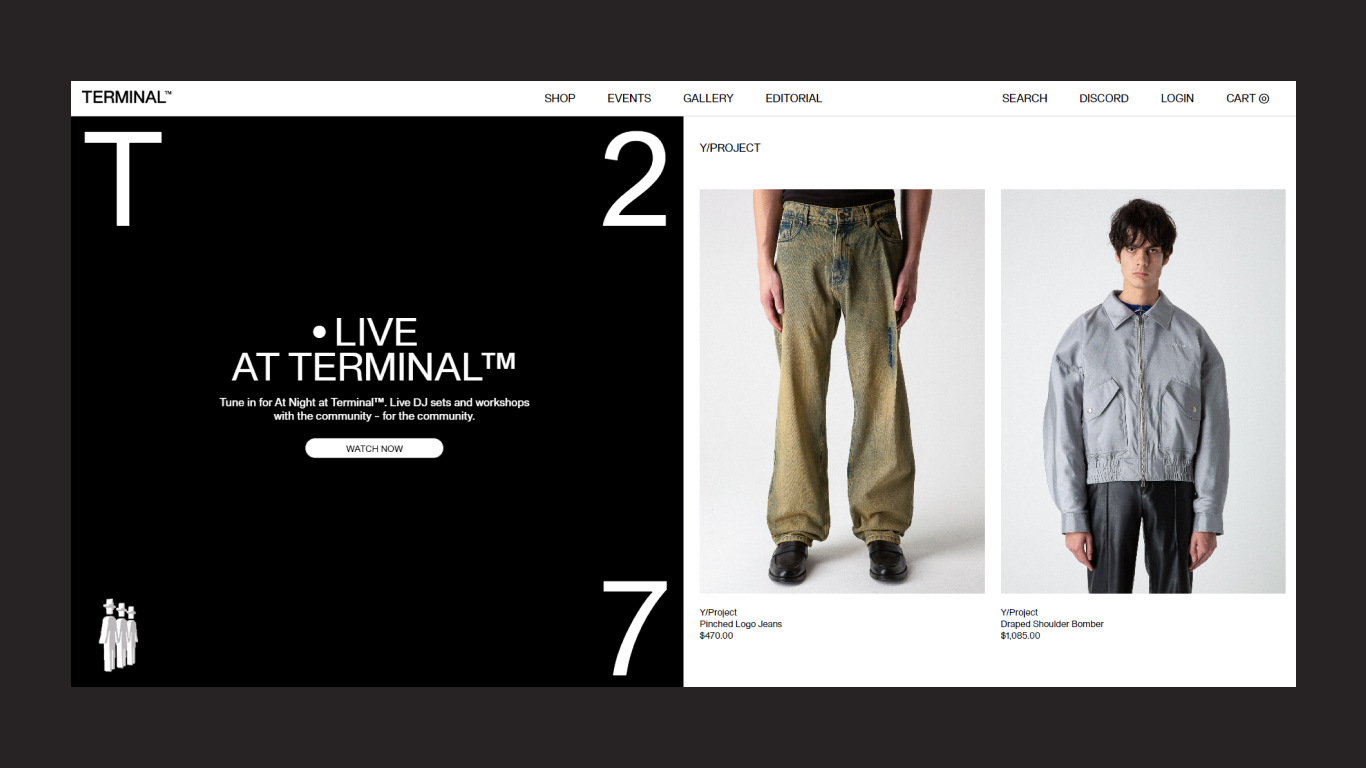
terminal27 is an online men’s and women’s online shopping website basically an eCommerce website. The website features and functionality is cool and simple header navigation and menu link hover effects and also has a dropdown slide-down submenu when you hover a shop menu. the scroll down to the home page then the left side is fixed and the right side is scrolling you hover the right side items, and the same thing reflects the left side so it is very cool and unique. I recommend visiting the website.
Pierre Choiniere
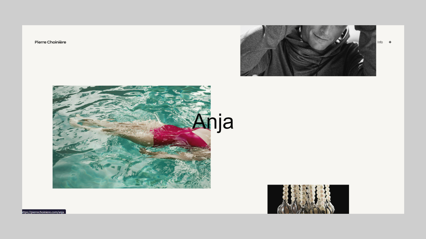
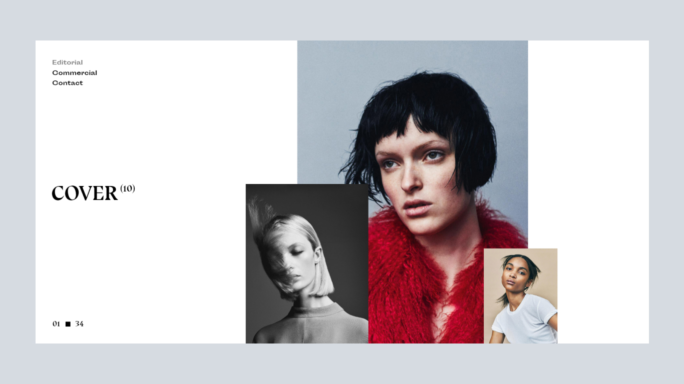
PierreChoiniere is an fashion photography website and Choiniere is the first photographers to have worked for Clin d’ceil and Elle Quebec. Amazing loading effect when user enter the website before showing a loading effect an it’s amazing just like a fade image. Clean and minimal white spacing and parallax scrolling website. when you scroll down to showing her photography projects, header is fix so you scroll down or up it’s always showing so you can easily moving to the other pages just click top right side info button and show full screen overlay menu you can choose the one of them. overall experience is very good i hope you love this website.
yelvy
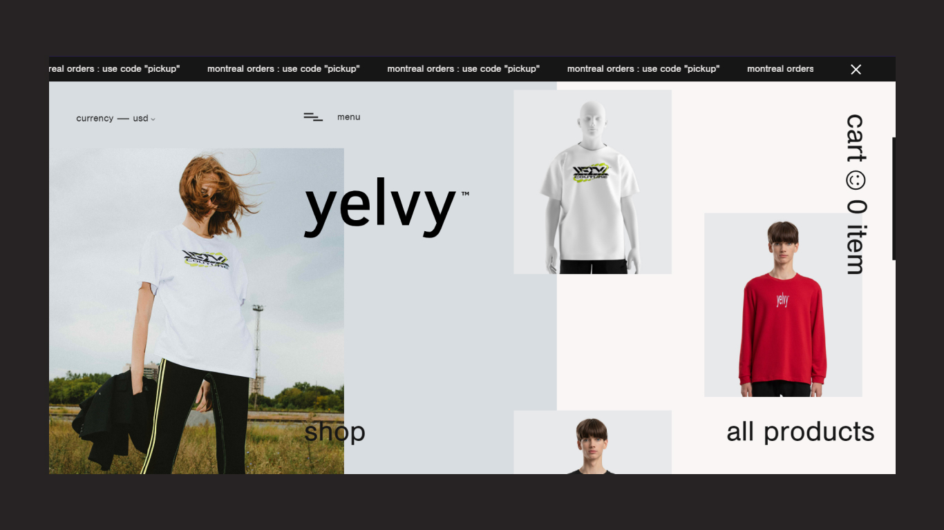
Yelvi is an online store website. less loading time and stake scrolling effect, white spacing, and clean website design and custom development using WordPress cms platform. and gsap library used for animation. The navigation toggle menu is unique, he divided two parts using delay transition. and also use the page transition effect when you click another page’s link. overall website experience is very unique, highly recommend visiting the website.
How to navigate to another page with smooth scroll
Smooth Page Transition Animation
Akris
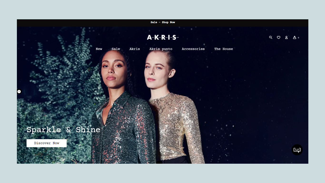
Akris is a designer fashion and luxury clothing and handbags selling website. This website was made in Shopify. The first hero section is a simple image then scroll down to the second section is video autoplaying functionality, after showing her products. and the footer is fixed. and a simple dropdown menu when you hovering the navigation menu. it’s a quite a simple and cool website.
Landing page design with background video
Lasse Pedersen
Lasse Pedersen is a hairstylist. if you can visit this website so first of all, you’ll see the simple loader with her and then enter the main website or homepage. left hand side her name and right side her image then you scroll to swipe horizontally. and one by one show the works so it’s really cool and the overall experience is good or unique.
Minimal fashion website landing page design
Humankind
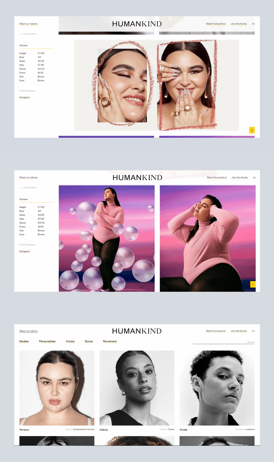
Humankind is a unique talent representation agency website. When you are visit the website first you will show the top of the logo and navigation menu links maximum 2-3 links are there and next is the slider. the slide is auto pley and cover all the screen no title or description. if you want to visit other pages, just click the top of the menu links and show there other content or profiles. and this website availables in two different languages. i hope you love this website. my overall experience is cool because it’s clean and user friendly website easy to understand of any users so that’s the good point for me.
Fullscreen navigation menu with animation
Julie Cristobal
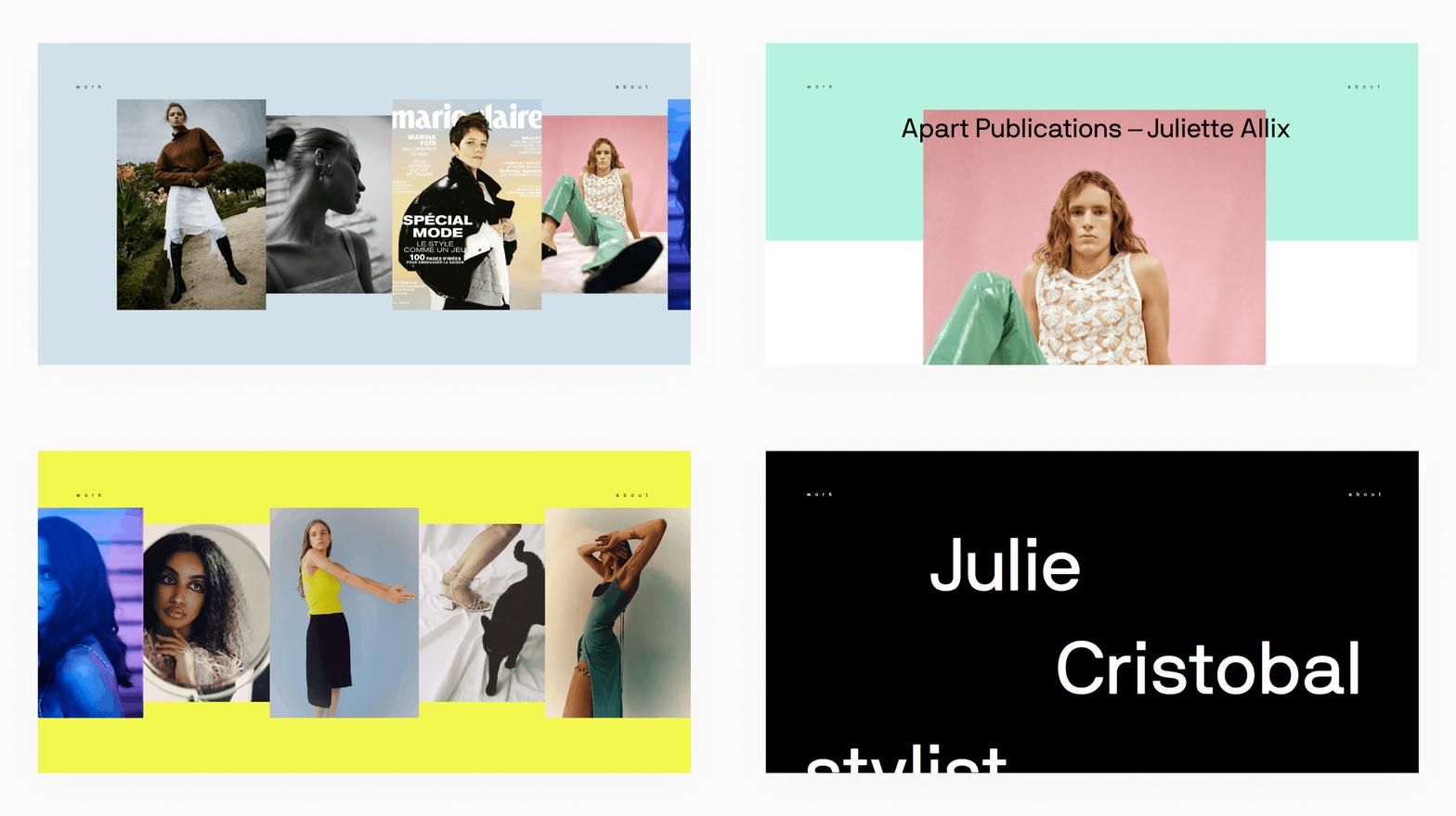
Julie Cristobal is a french stylist. less loading time, whenever you visit the website, within a second open this website. The intro animation of this website is slide up several images in a curve shape after a second it is just a normal horizontal link adjusted. then you can scroll the website horizontally scrolls because it the based on current website trend. Also used for page transition for smooth page loading effect when you click any project to show the page transition effect and smoothly page load. one of the famouse page transition plugin is barba js. guy, you can use this plugin. Also, I upload the barba js page transition video tutorial of my youtube channel you must watch if you are using barba js plugin. now we are back to the website, this website experience is really good because this is the inspiration for your next project or your personal portfolio website you can showcase your portfolio, photographs, or any other things to do on this type of website. bookmark this website it is very useful.
Vermillion Jewelry
Mercenaire
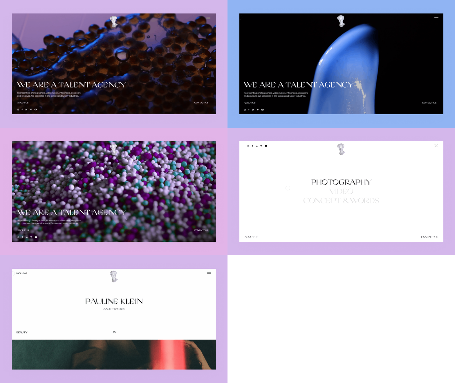
Mercenaire is talent agency, specialize in fashion and luxury industries. Full screen video auto playing when you enter the website and scroll down to next image or video, 6 to 7 section is there in home page. next i’m talking about header, the header top center is logo of Mercenaire and right side is toggle menu icon. when you click to toaggle menu icon to open fullscreen overlay menu. this website functionality is smooth scrolling, custom cursor animation effect and smoothly page transition and also this wbesite layout is neat and clean, i hope you love this website, recommend to visit this website.
Fullscreen Navigation Menu Tutorial
Mercenaire
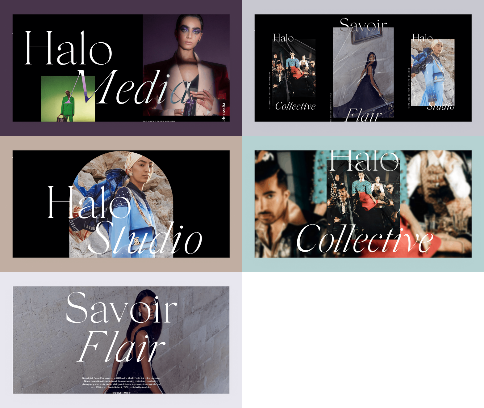
Halomedia is a next generation award winning digital media creative agency. Top of the header is simple but creative when you hover a any link of th menu(Hover Effect 1st, and 2nd), all body content slightly slide down and hover out to back to the position. This website is really creative and all the thing in this website is scroll based like wehn you scroll down to scale images(Image Hover Effect), left to right text moving, playing video to center of viewport, parallax scrolling elements, footer is fixed, custom cursor, page transition, image follow mouse pointer, real time fadein effect. All the thing to do in this website is real time scroll based animation (1st, and 2nd) and effects based on your screen/window viewport. Overall experience is really good and rich feel, i think you guys must visit this website if once you have a time or good internet speed.
Modelogic
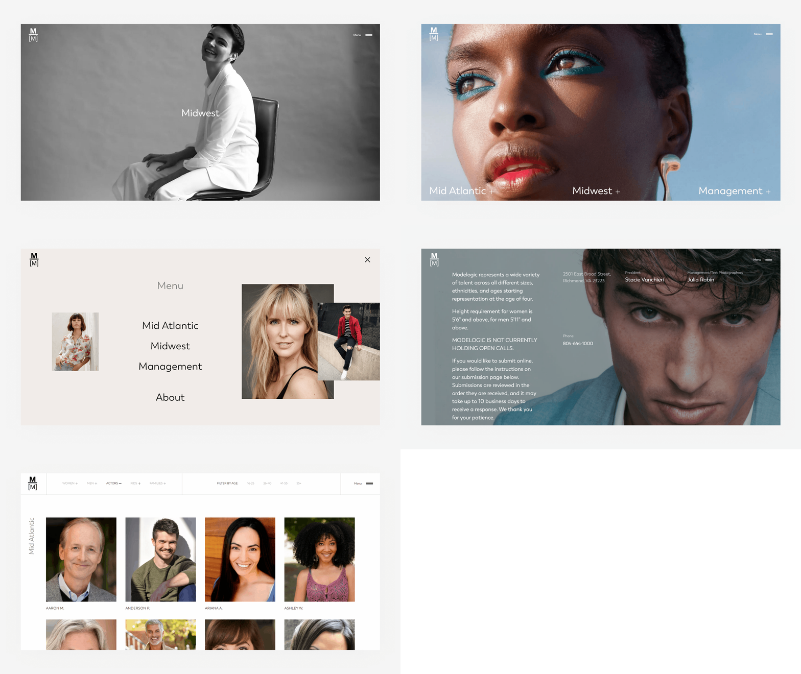
Modelogic is a modeling agency and his work globally. You open this website the first screen you will see full screen model image and top of the page left hand side is logo and right hand side is toggle menu button, and bottom of the screen is menu links that is services and cool hover effects. when you click any one then you will see the video of specific service and it’s full screen and scroll down to see other content, after all you see the same thing on rest of the pages except to the about page. The best things in this website is parallax or smoothscroll feels and scroll based animation. i already made smoothscroll effect videos tutorials, parallax effect video tutorials and scroll based animation tutorials you will see in my youtube channel. the overall experience in this website is great simple, clean and minimal website design.


